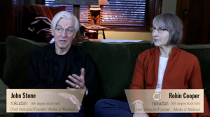
Editing has begun! And now, lots of decisions to make – where/when to cut, what to cut-to, and how to make everything visually hold together; one hurdle near completed (I think): design of “lower 3rds” (industry lingo for text identifying speakers):
Graphics created as “titles” in Apple Motion 5, and published to Final Cut Pro with editable parameters.
Is the samurai sword-blade effect subtle enough?! At this point I think the design will work; I’ll see how it bears out across the rest of the editing process.

